SparkCode Professional - Column Charts

Option dialog for Column Charts.
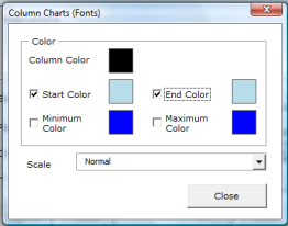
Supported Options
Column Color - click the color box to set color for the columns
Color - select the appropriate checkbox to change colors for the Start, End , Minimum or Maximum columns

- Start Color - click the color box to set color for the Start column
- End Color - click the color box to set color for the End column
- Minimum Color - click the color box to set color for the column with Minimum value
- Maximum Color - click the color box to set color for the column with Maximum value
Scale - Three scaling modes are available for column charts.
-
Normal - create a spark column graph based on the minimum and maximum values of the data series. Positive values in the data series will be mapped to a positive column and negative values will be mapped into a negative column.
- Map all values into the range 0 to 100 - create a spark column graph by mapping the minimum and maximum value of the data series into the range 0 to 100. The smallest value will be mapped to 0 and the maximum value to 100. All columns will be positive columns.
- Map all values into the range 0 to -100 - create a spark column graph by mapping the maximum and minimum value of the data series into the range 0 to -100. The smallest value will be mapped to -100 and the maximum value to 0. All columns will be negative columns.
The following image shows the three scaling modes applied to the same data series.

Notice for the mode Map all values into the range 0 to 100, all the columns will be positive even though the data series contains several negative numbers.
Notice for the mode Map all values into the range 0 to -100 , all the columns will be negative even though the data series contains several positive numbers.