- TinyGraphs
- SparkCode Professional
- Duplicate Remover
- ConnectCode Deluxe Add-In
- ConnectCode Barcode Font Pack
- ConnectCode Number Manager
- ConnectCode Text Manager
- TraderCode Technical Indicators
- Neural Networks Trading
- Financial Modeling - Free Investment and Financial Calculator
SparkCode - Create Sparklines Dashboard Reports in Microsoft® Excel®
SparkCode Professional is an Add-in for Excel® that lets you create Sparklines (an invention by Edward Tufte) - data intense, design simple graphics that are as small as a cell - using TrueType fonts. It is useful when you need to create a Dashboard in Excel containing large number of these tiny graphics for visualizing trends and comparing vast quantities of data.

John Johanson - Butler Manufacturing
"This amazing software improves my abiliy to create very professional business reports. It's really great!"
Paul Dashwood - PlugNet
View our Testimonials
How It Works
SparkCode Professional works by generating a sparkline for every row of data in a rectangular block of cells. The following shows several line graphs each placed within a cell.
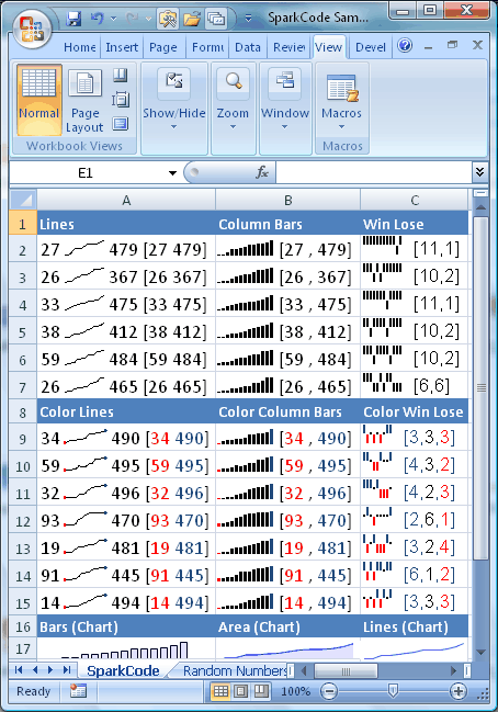
To create these tiny line graphs in Excel, you simply open up the main dialog of SparkCode Professional, select the block of cells and click the OK button. A graph will be generated for each row of data.
What is interesting about these graphs is that they are actually text strings. They are as easy to handle as text. You can resize them by setting their font sizes, or copy and paste them to another cell, or another software. Because they are about the same size as the words around them, you can present them very elegantly by embedding them within your Excel reports or dashboards.
Other types of Charts supported by SparkCode
|
 |
 |
SparkCode Professional (Sparkline Software)
SparkCode Professional is very powerful indeed. It is able to generate many types of charts with many variations. The charts can even be colored and contain accompanying text that highlights the features of the graphs.
The following lists the chart types and the options that are supported.
Benefits
- Produce powerful intense graphics, condensed into a single cell
- Consolidate all your information into a single worksheet
- Visualize large quantities of data for different scenarios
- Compare and spot trends to get the big picture
- Get all the information you need in a single screen
- Well suited for financial, scientific and business visualization
Samples
For a sample PDF file of the sparklines and charts created with SparkCode Professional add-in for Excel , please click
SparkLinesSample.pdf
BulletGraphSample.pdf
BarGraphSample.pdf
DistributionBarGraphSample.pdf
MiniPieChartsSample.pdf
Features
- Produce text based sparklines or charts using TrueType Fonts
- Charts are easily portable to third party softwares supporting text and fonts
- Accurate and precise print-outs
- Support for markers at the start/end/min/max position of a graph
- Coloring for different types of markers and columns
- Scaling options that attenuate the features of a graph
- Uniform scaling for multiple rows of data for comparison purposes
- Automatic generation of multiple charts from multiple rows
- Advanced, customizable, colored text accompanying the charts
- Simple user interface
- Implementation for Lines, Lines with Dots, Dots, Columns, Win-Lose and Win-Lose-Draw charts
- Works with Excel 2003 and Excel 2007
Download and Purchase
To download a free trial of SparkCode Professional, please visit the Download page
To purchase a registeration key for SparkCode Professional, please visit the
Purchase page.